What makes a website easier to use?
Clear structure, familiar patterns, and thoughtful details help people find what they need.
Editorial preview notice: This article is a sample draft created for demonstration and structural review.
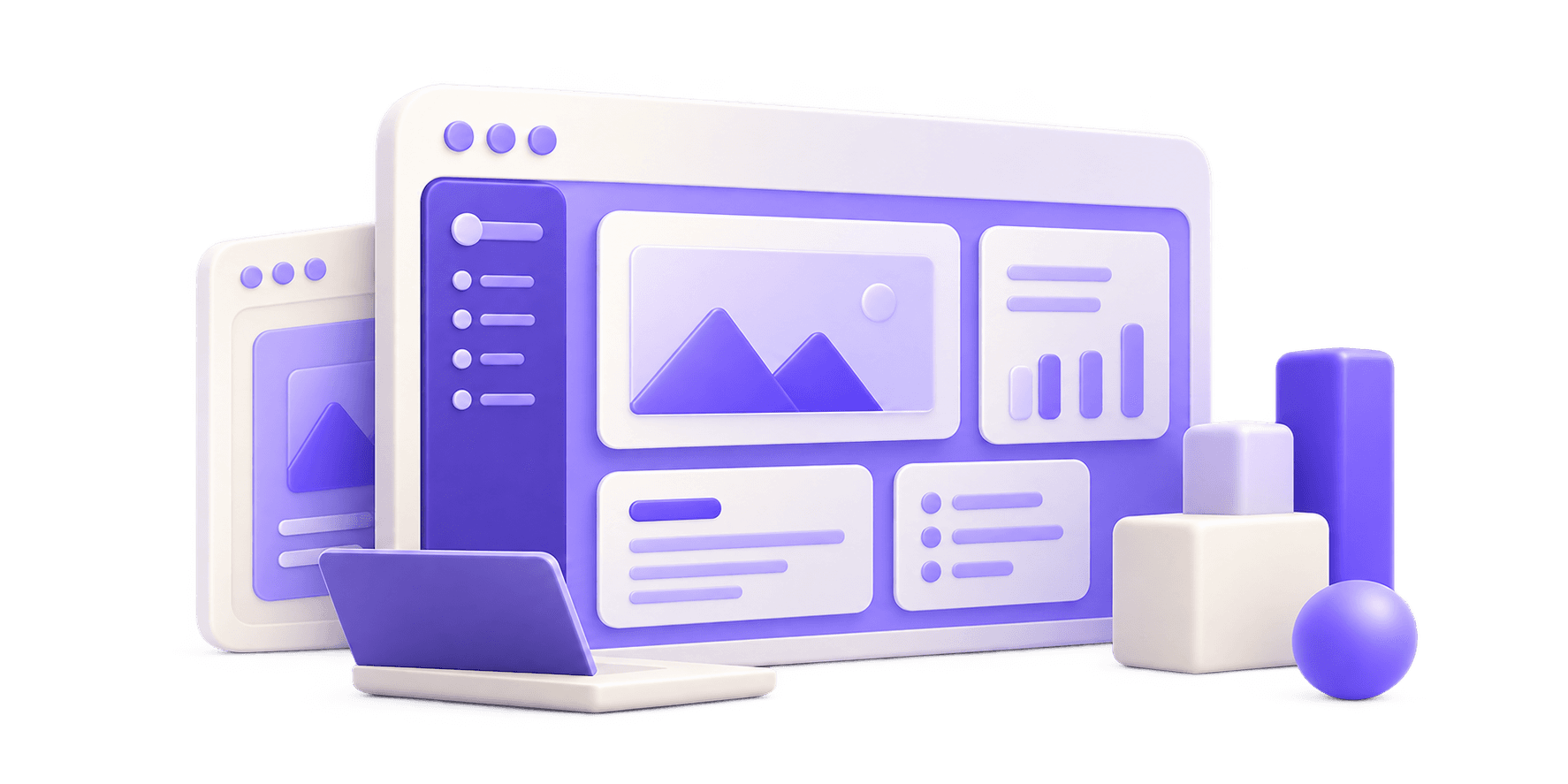
Table of contents
1. Navigation Labels and Structural Clarity
Great website usability relies on intuitive predictability. Visitors expect standard layout conventions: logo at top left, primary navigation items across the top or side header, clear page titles, and recognizable call-to-action buttons. Group related content logically and keep menu item labels short and descriptive.
2. Visual Hierarchy and Readable Content
Text must be effortless to scan and read. Maintain comfortable line height (1.5–1.65 font ratio), select strong color contrast ratios between text and background, and use consistent typography scale hierarchies across all subpages.
Key checklist items:
3. Form Usability and Accessible Inputs
Forms are often the primary conversion bottleneck. Simplify form fields by removing unnecessary questions, providing clear inline labels, displaying visible error messages next to relevant inputs, and auto-focusing initial fields where appropriate.
4. Mobile Layouts and Touch Targets
A desktop interface can fail on mobile if clickable targets are small or stacked tightly. Ensure interactive buttons and links provide at least 44x44 pixel touch areas and stack content cleanly without horizontal scrolling.
5. Task-Based Usability Review
Regularly test your website by observing first-time users complete core tasks—such as finding pricing, requesting a service, or sending an inquiry. Real task testing uncovers navigation bottlenecks that internal teams frequently overlook.
Related insights
From idea to useful product: where to begin
Start with the problem, define the people using it, and choose the smallest useful first version.
AI features that solve a real problem
Focus on practical use cases, helpful outputs, and a simple experience.
When a custom dashboard makes sense
Turn your data into something useful for the people who work with it.